How To Add Smaller Pinterest Images In Your Blog Posts
One of the primary benefits that Pinterest has over other social networks is the ability to add Pinterest "pin this" buttons to the images in your blog posts. Since all of your blog posts are going to have images, it's just one additional call to action.
The best part of these pin buttons is that they're typically invisible until the user hovers over the image. Thus, they don't get in the way of usual browsing, but people who know and love Pinterest already know to look for the button, and will find it immediately.
Of course, just putting your images up on Pinterest isn't going to be ideal. If your images are too wide or too tall, they can be cropped or stretched in ways that make them look sloppy. Then your social media presence on Pinterest ends up looking sloppy, and that's not a reputation you want.
So, what size should you make your blog post images if you want them to appear natively on a Pinterest feed, without distortion?
Aspect Ratios
So, do you know what an aspect ratio is? It's a common term for sizes, or scales, without having fixed definitions. You see it with monitor screen sizes, with the resolution of videos, and yes, with images.
An aspect ratio is expressed as a ratio, something like 4:3 or 16:9. Those two are common, in fact. A 4:3 ratio is a classic standard definition television size, the almost-square size you probably haven't actually seen since CRTs gave way to LCD televisions. 16:9 is similarly a standard widescreen definition; many modern PC monitors fit that aspect ratio.
An aspect ratio is simply the relationship between two dimensions, horizontal and vertical. So an image with a 16:9 resolution will be 16 pixels wide for every 9 pixels tall. A modern PC resolution with a 1600×900 display is in 16:9 resolution. 1920×1080 is also 16:9.
So what does this all have to do with Pinterest? The answer is simply that Pinterest doesn't tell you the image size you should be using; they tell you the aspect ratio they prefer.
What Pinterest Has to Say
Pinterest has a post about aspect ratios and their recommendations for images you use on their site. You can read the post – at least, the 2019 version – here. As usual, if you're reading this in the future, you should probably check to see if they've updated it or published a newer version.
Pinterest images are largely vertical. This is in contrast with a lot of other social networks, that either use squares or horizontal images, due to the vertical orientation of feeds. They can fit more content on a page that way, especially with widescreen computer monitors providing more horizontal space than vertical space. On the other hand, phones are vertical, and mobile device usage is increasing. Pinterest catering to vertical imagery is not really a surprise.
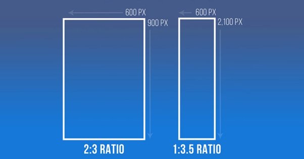
Specifically, Pinterest generally recommends images that are 2:3 in aspect ratio. If you have an image that is 600×900, or 1000×1500, or 1200×1800, you have a 2:3 aspect ratio image. Images that are too wide may be cropped smaller or squished inwards to fit, and that's going to distort the image. In some cases it might not be really noticeable, and in others it will be much more annoying. With images that include text especially it can be obnoxious.
Pinterest also has a "creative best practices" guide you might be interested to read. It includes a variety of tips about how to create great pins for brands.
Pinterest Product Specifications
Alright, so listing out the aspect ratio isn't really technical enough for some of you, and I completely understand that. Just saying a 2:3 ratio might be fine for casual images and organic sharing, but what if you want to run ads or use any other form of Pin? What if you want to know the more technical details? Thankfully, that's covered as well. You can read the product specifications here, but I'll summarize the important points for images below.
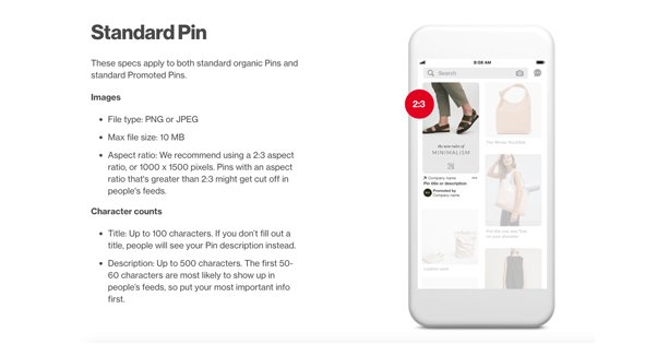
Standard Pins are your basic Pinterest post format. This includes basic organic posts as well as promoted pins, which are just standard pins that you pay to promote. These can be either PNG files or JPG files, and the maximum file size is 10MB. They recommend a 2:3 aspect ratio for these images, taller than they are wide.
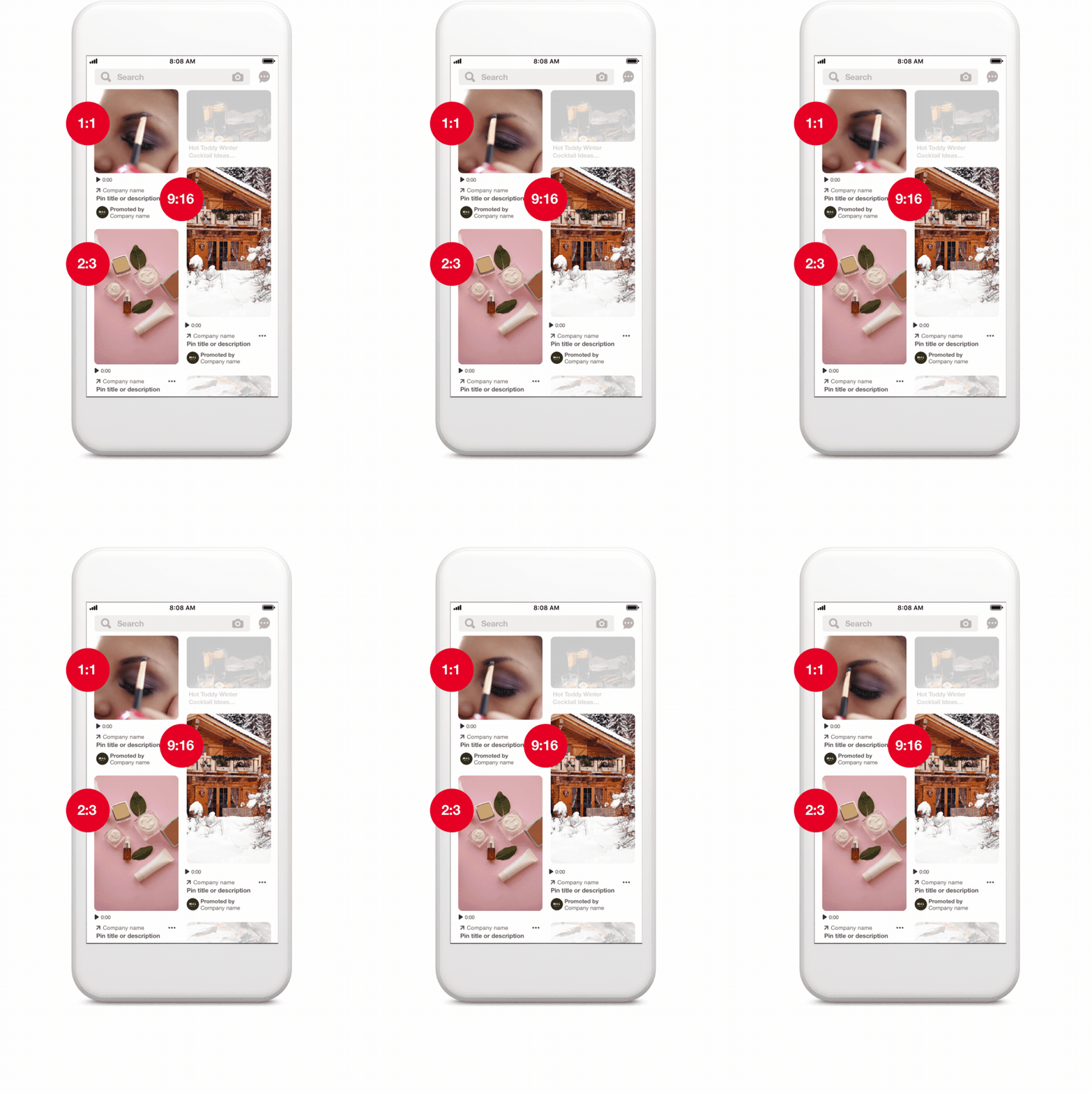
Promoted Carousels are sets of multiple images that can be flipped through, with a swipe on mobile or with clicks on desktop platforms. These can also be PNGs or JPGs, and you can include anywhere from 2-5 images per carousel. Unlike Facebook, they don't slightly overlap, and only the dots below the carousel indicate that there are multiple images in it. Your images are still limited to 10MB each. Importantly, you can still use 2:3 ratio images, but you can also use perfectly square 1:1 images.
It's important to note that you can't mix and match different ratios for different images; your pin will take one format or the other, and images that don't fit won't display properly. This also means that you can't use anything between those two ratios, since those are two fixed formats, not a range.
Pinterest in Practice
Using a 2:3 ratio for your images sounds like it should be easy, but Pinterest doesn't actually seem that uniform when you visit it. There are some images at a 2:3 display, but others are much taller, and some are square. Pinterest seems to have a relatively fixed width – the number of columns changes when you scale your browser, but not the width of the images.
In practice, pins that are very long can stretch vertically, but do not expand horizontally. Anything taller than 1:2.1 will be cropped. Taller pins generally still attract more engagement, since they can show more interesting content and have more space for text. Of course, your pin needs to be interesting enough to consider that use of vertical space worthwhile.
In terms of sheer dimensions, you can't upload something too small and hope it works. Anything smaller than 564×846 is too small to really make use of space. Anything larger than 2000×3000 is going to take up too much space and slow down both your website and Pinterest. Depending on the resolution of the image, it might lose detail when compressed as well, and it's possible it could be over the 10MB file size limit, though that's rare.
When you're actually looking at a Pinterest feed, what you see is pins that are 238 pixels wide. The height varies depending on the pin. Expanded pins display at 735 pixels wide and however tall they actually are, within the proper aspect ratios.
Does Using the Pin It Button Work?
So here's a question; does actually using the Pinterest widget work for your blog? After all, blog format images usually work best in a horizontal format, and sharing those images on social media works best when they're horizontal. Should you switch many of your images to vertical just for Pinterest?
My answer is: probably not. Large vertical images in your blog posts take up too much space, so unless they're powerful images – like infographics or tutorials made up of images stitched together – they aren't going to work well on Pinterest itself.
Here's my recommendation, and it's two parts.
First, you want to use normal blog-format images on your site. You can use the Pinterest widget if you like, and if it brings in traffic, there's no reason not to. However, it shouldn't typically be the main focus of your Pinterest marketing.
Instead, you need to take control of your Pinterest presence by uploading your own custom images for your posts. Creating special vertical images for your posts will work much better than using stretched horizontal images or dealing with crops. You can use a vertical adaptation of the images you're using on your blog, or you can create unique new images that don't appear anywhere on your site, it's entirely up to you.
For real power with Pinterest, you should consider creating graphical tutorials and infographics. Infographics can be very compelling, because they're tall, they have a lot of useful information and interesting graphic design, and they encourage engagement. Tutorials are the same, plus they're easier to make just by stitching images together vertically and adding text.
Examples of Pins and Analysis
I've pulled together a few examples that might be worth looking at, as well as some basic analysis of why they might work or might not.
This pin is not a great pin in my opinion. Someone threw together a list of "side hustles" you can pick up to make money, and rather than include any graphic design or interesting elements, they just packed all of the jobs into the image. It's a lot of text that runs together, and the only reason it gets clicks is people have to expand it to actually read it.
This pin is an example of an expanded blog post image. An image similar to that one is on their post, but it's not one of the primary images for the post; instead, this is an image made vertical with text that includes the title of the blog post and gives you an idea of what you'll get if you click. It might not be clever or deep graphic design, but it's functional.
This pin is a similar example. At least, it would be if the website it led to was actually what it claimed to be. I clicked on that pin expecting to see a list of backyard moneymaking tips, and instead I go to a blog about reducing your carbon footprint, that has no images in it at all. It's essentially click-bait at that point.
This pin is a better example. This is what it looks like if you use a Pinterest-formatted image in your blog post. If you click through that pin, you see the top image of the site is that image. It's very tall and pushes the actual content of the page below the fold, which is not good practice and is part of why I never recommend doing this. The image may be compelling on Pinterest, but is the SEO hit worth it?
This is a great example of an infographic pin that just barely doesn't make it. It's a clever infographic, but it's much too small to actually be read even on a desktop screen. That might encourage some users to click through to read it, but others will be disappointed and will leave.
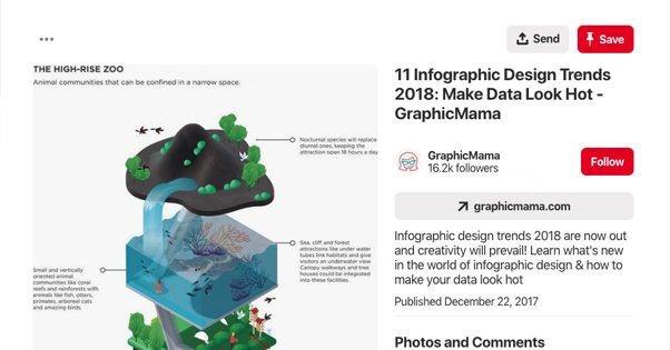
This is a better example of an infographic that works. It's a visual image that's tall enough to be nicely vertical, and the text on it can be read when you expand it. It's attractive enough to work in a blog post or in a social media feed and still gain attention. It doesn't work as an article top-of-page cover image, but it's not meant to be there either.
These should give you some basic idea of how Pinterest handles images, and some of the technical specifications for images as well. Just bear in mind that displayed images on a Pinterest feed are small enough that small text is often hard or impossible to read, and make your images scaled appropriately.

Drew Hendricks is the CMO of Blogpros and a contributing writer to Inc., Entrepreneur and Success.
How To Add Smaller Pinterest Images In Your Blog Posts
Source: https://blogpros.com/blog/2019/06/size-blog-images-pinterest
Posted by: williamsstalow.blogspot.com

0 Response to "How To Add Smaller Pinterest Images In Your Blog Posts"
Post a Comment